My choice for the penguin 2021 student competition is The Uninhabited Earth, by David-Wallace-Wells

I decided to choose this book due to my personal interest on the matter it holds itself within, it’s interesting and striking subject matter should prove to be a good basis to generate simlarly stunning imagery and type systems.
My thoughts on the book at this early stage in the project are that visuals should refelct the morbid and surprising tones of the book. However the book is written in a sophisticaed tone, this paired with the current cover being quite minimalist makes me think that my visuals should reflect both of these charactersitics and give a clear, professional yet visually hard hitting aesthetic.
Something that stood out to me within the book that I think is persistent throughout is the idea that the stories people have been told that someday not too far away global warming and complete apocolypse is coming, the book states that this is coming far sooner and will be far worse than first thought. The book then proceeds to detail the horrible events that are almost inevitable in the very near future, this overall creates a dark and hopeless tone within the book.
Judging from previous winners of the penguin awards, I think that the key to creating a successful book cover seems to lie within illustration, accompanied by a very themed and consistent typography system in place. Illustration is not my first inital thought when attempting to tackle any project and so this will prove to be a challenging and skill aquiring project for me if i do choose to go down the illustration root. I think that illustartions naturally make for interesting book covers due to the wide range of styles available, this allows the boko cover to stand out when placed on the shelf.

Researched Conceptualisation
The Human Effect
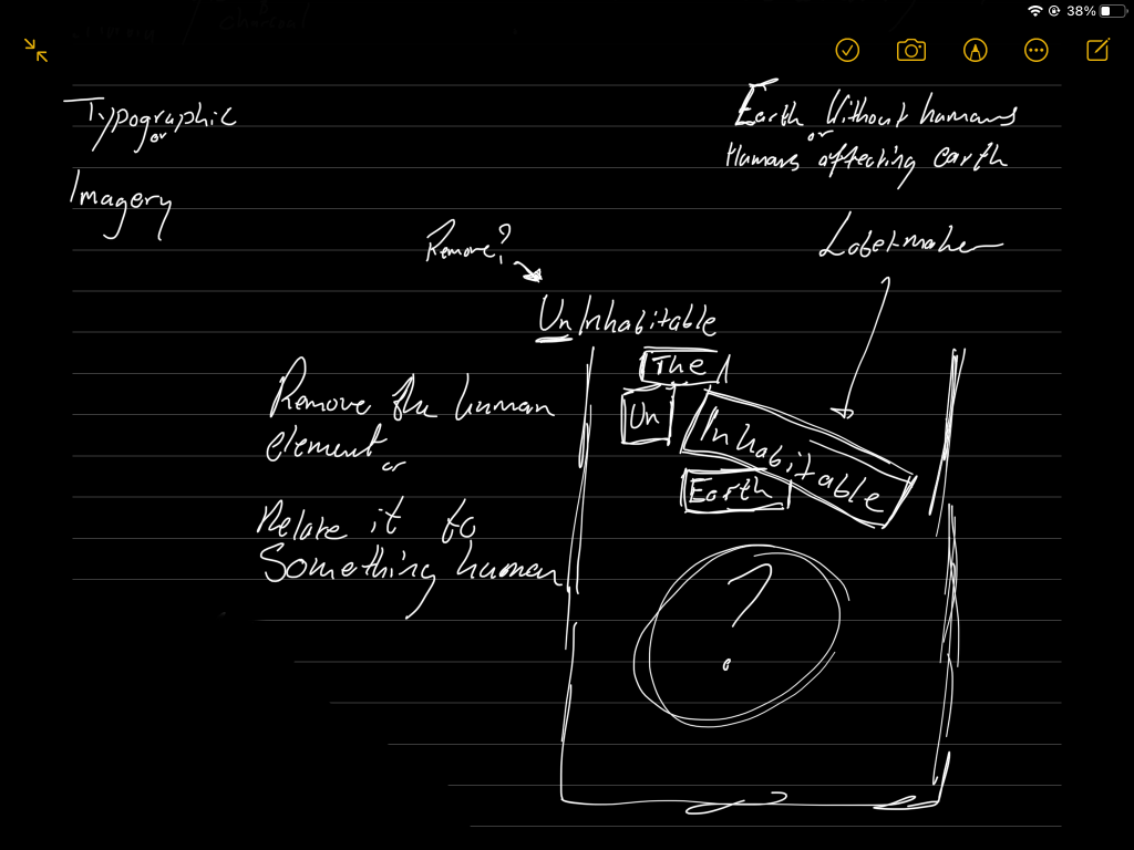
Humans & life itself play a key part of this book and so I think this should be a key consideration when experimenting with visual styles, the book tells of humans eraditacting the earth and tells us we are in a short state where the earth is rapidyl being destoryed, but humans remain for the time being. This raises important questions as to whether the book cover should feel very human, or alternaitvely should be devoid of human feeling and look desolate, mirroring an uninhabitanble earth.
The situation that we find ourselfs in suggests that the realtionship between the two states should be shown. The desolate world interacting with very human elements, this immedatley brings ideas into my head for typefaces choices and makes me think I should include multiple typefaces, displaying the two different states, showing their interaction throughout the covers as well as the spine. This will need to be done intelligently, but still be obivoius enough as to be able to successfully translate the realtionship within the typefaces. I think that the least human appearing typefaces would be those found within label makers or typewriters. I think there is less human interaction within a label maker font and so this could be an interesting visual style to experiment with soon. As for expressing emotions, caligraphic typefaces naturally look very human and hand made, however I think that a professional caligraphy font would look to perfect, in my own opinion, what makes something appear human is not only seeing it has been made, but being able to see how it has been made in the finished product. I would need to find a balance between a rough handmade typeface and still having my cover be high quality and professional.


The label maker type can be easily manipulated and colour adjusted as to fit the visual style of my cover, inverting the text can allow it to stand out on a dark background as well as the plate backgrounds the letterforms sit can be used as an opportunity to have the text interact with surrounding elements, or perhaps even other text placed on the page.


My first experimentation for my penguin book cover focusess on using a smooth and varied colour pallette and in particular experimenting with the use of a physical typeface produced from a label maker, and having the two typefaces used interact with each other, in thhe hope of showing a relationship between humans and their destruction. I think of the colour palletes used here, a mixure of the bright red and charcoal blacks and greys will be most effective for this type of cover, I think this will translate a dark and dangerous atmosphere as well as giving the flashes of red particular impact when placed ontop of a much darker background.
I think that these covers show an effective concept, particuarly within the type systems, the use of a label maker font is effective and serves to give the book cover an interestig and engaging finish.
Self-Eraditcation
A concept that I picked up while reading the book is that humans are eradicating themselves off the earth, and so this prompts me to think, what else’s own existance leads to that things destruction? The list included
Wax (Candles)
Rubber (Eraser)
Fire
Fuel
These objects beging their rapid death the minute they begin ‘Living’. I think this prompts a number of interesting metaphor filled visuals, buring the candle at both ends is already an established metaphor that I could apply a ‘The Uninhabitable Earth’ Themed spin on it, then use that as the main visual stimulus for the front and back cover. This linkks both the use of candles and fire, fire is a particularly poignent basis for metaphor, however it may come out as cliche with all the mentioning of global warming and natural disasters present within the book.
Upsetting the Balance
Humans have been repeated documenteed upsetting the balance of the earth, This presents oporunties to visually and typographically play with scales, delicacy and one event influencing another.
Particularly tpyographic opporunties are brought to mind when thinking about the upsetting of the balance of the earth, a typographic scale that represents urgency and danger, with the entire human kind resting on the tilted end, with everything to play for, and no action being taken to stop the immentent disasters that are upon us.
Toys & Recklessness
We are always told we are ‘children of the earth’. After some thought and brainstorming there seems to be particulalr correlation between the behaviour of a child and human kind treating earth. Exploiting resources and behaving with reckless abandon seems to mirror the behaviour a child has with a new toy, only leaving once the delicate and complex toy has been broken and shattered on the floor. With this metaphor in mind there are plenty of visual concepts that could be explored here, the delicacy of the earth being represented and the shattering of this object, left abandonned to represent the situation humanity finds itself in.


Translating the delicacy of the earth to an egg, full of life, balancing on a thing needle is an interesting image for my front cover, the lack of sustainability of an egg balancing atop a needle is, I think closely related to the situation explored within the book, the story is continued on the back as the egg splits and the yolk works down the page and interacts with the text that surrounds it.
I think this concept is very strong, at the moment the illustrations are only rough sketches and would require refining before my submission. I think that the egg could interact with the text to a more creative extent and that in turn would result in a more playful and interesting front cover. The back cover is stronger at this time due to the layout and type setting, this will still be worked on and the typeface may be changed, however I think that one I have chosen is working as an effective way to translate a human factor in the destruction that is surrounding human kind
The colour scheme is currenlty too bright, this would work if the material were saterical, however for this particualr book I think the colours needs to refelct simiar messages that the text, apppearing human but destructive, this is very much a light hearted approach to the brief, I think the majoirty of the strength lies in the imagery, a revision of the colours and typefaces will help get everything else up to speed.


After reviewing and changing the text and colours I think this cover works much more effectivly, more accuractley portraying a sinister and almost classic horror aesthetic this example works to conern the audience and help the browns of the image and text to bounce higher of the page and elevate the book cover above others that would surround it on the shelfs.
Lack of Hope


A further atmophere created within the book is this feeling of ‘no hope’. Humanity perhaps has gone too far down the hole to be able to crawl itself out, seemignly creating the perfect mechanisms for their own destruction, this is represented by the nut placed firmly into the nut cracker, as humanity the squeesing has begun and there is only a short matter of time before earth crumbles into uninhabitable.
I like the concept for this cover and I think it can benefit from further exploration, the visual style is simair to my previous example and thus I think it is successful, the colour scheme goes further into this dangerous and sinister atmposhere, while the current image is a photograph I think that it perhaps should be illustrated, in similar colours. A duotone scheme may work to lay out the facts with less nonsense, given the book spells out the facts without beating around the bush this may be a very effective method of exection.
Moving forward I think all my ideas would benefit from further developement in the couple of days remaining in the project, my time for conceptualisation has perhaps ended and I should spend theh remainder of my time reeling my ideas in and refining them into their best possible outcomes.
