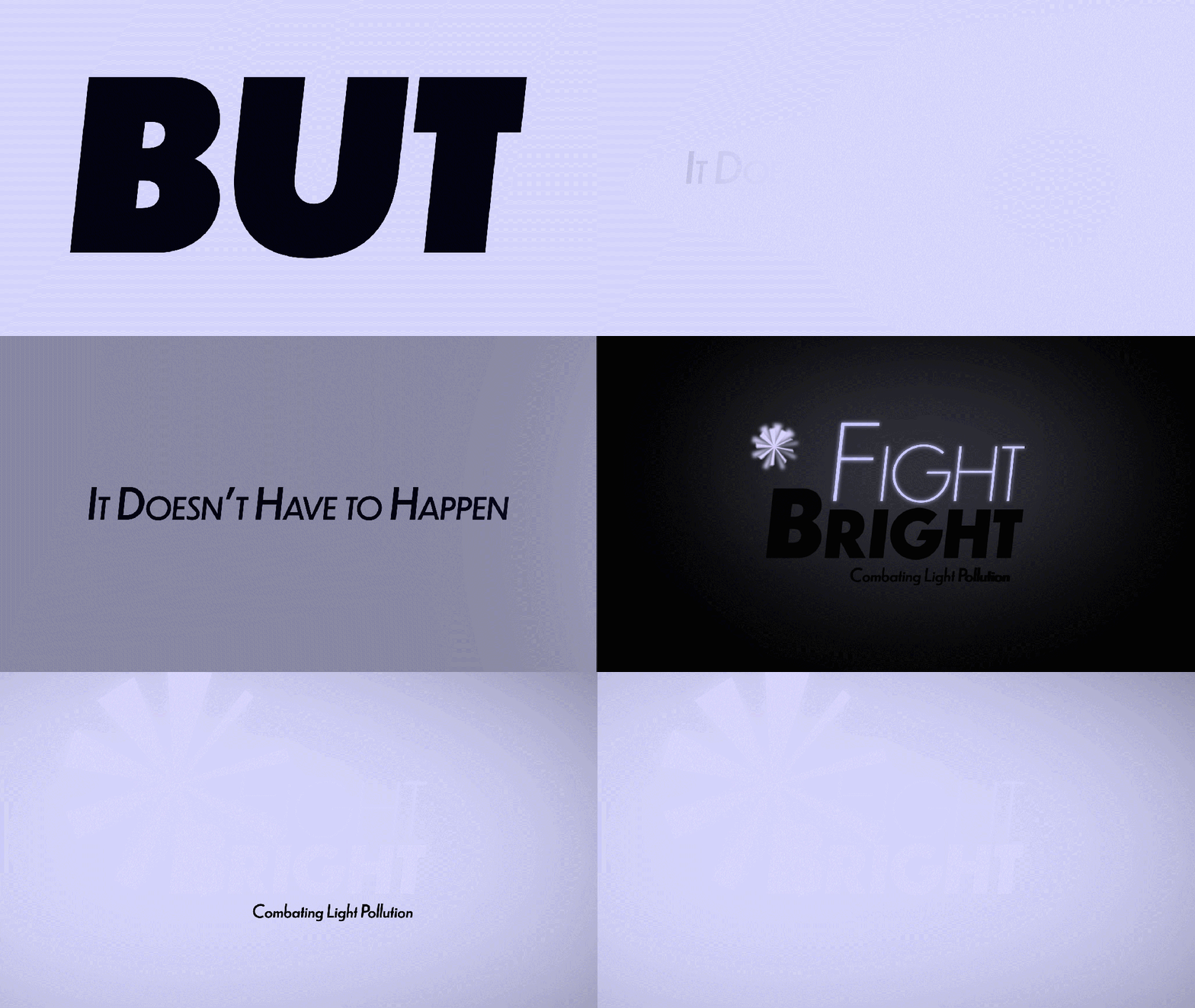

With the name, logo and type working together, it seemed the right time to go through all of my previously made content and fix the issues brought up as well as incorporate general refinements. I think as a whole the animation is now much more effective, the effects that are used are used throughout but they also have smaller, detail oriented changes to them, even the smallest things like having small offshoots of lights in the animation directly above to show a downward facing lamp, as well as easy easing the keyframes so you get that nice sense of flow and softer revealing, down to the smallest details input here, having the light glows themselves be one frame out of timing so you get the tiniest sense of travel between the actual letterforms glowing, then the larger glow emanates from the sources, I think this all works together to give a more realistic motion experience.